Monday, December 31, 2012

Plastic Surgery for Dogs? What the...?

Happy Holidays Everyone! How's break been for you guys? For me, I spent a week in SoCal celebrating Christmas. My family and I went to Disneyland, California Adventure, Seaworld, and Universal Studios! Walking around the theme parks was exhausting, but we spent a relaxing day cruising through LA, specifically Beverly Hills. That's how I came upon this billboard for canine plastic surgery.What?! Dogs can have plastic surgery like humans?? I've never heard of such thing until now...

To start off, I found this billboard vague because it asks "Is your dog a total 'dog'?". What is the meaning of "total"? Does that mean my dog isn't actually a dog? *gasp* Dr. Armond and his advertising crew probably meant that your dog undergoes plastic surgery, it will look much better. The example they give is of Brad the bulldog (at least I think he's a bulldog...) This example shows the great improvement of Brad's face. It was once all saggy and unappealing, then it became lifted and adorable. Clearly, the breed of dog is different by the color of the ears. In the before picture, only one side is brown, but in the after, both the ears are brown.

The technique that is used to hook the customer is Bribery. On the bottom right-hand corner, it says "Free Consultation". Stating that gives a feeling of curiosity because the consultation will tell what needs to be done to make your canine look more appealing to others. In a sense, this billboard also uses Snob Appeal because it's located in Beverly Hills, where all the wealthy stars live. Everyone there wants to make sure their pooch look gorgeous compared to the others. This billboard reminded me of the movie "Beverly Hills Chihuahua" because the main character is the pampered chihuahua Chloe, where she wants to be the best on the block. 

The need that satisfies this ad is the need for prominence. By giving your canine plastic surgery, it will make it look fabulous. People in Beverly Hills have a pretty high social status and want their pets to be the same. Plastic surgery ensures that they will be admired and have more potential.

To sum it all up, this billboard made me giggle a bit because I didn't know such thing existed. It wasn't the most effective ad because it seemed more humorous than serious. Ad placement was key for this billboard because it was located in Beverly Hills, where celebs pamper their pooches. 


Last post for 2012~
HAPPY NEW YEAR!

Sunday, December 16, 2012

Maybe it's Maybelline~New Dream Nude Airfoam

Once again, I was looking through the September edition of Allure and saw this ad for Maybelline's new foundation. The ad caught my eye because the model was holding this weird, foamy substance and I was curious what it was.

In a sense, this ad appeals to the need to escape. The product is "Dream Nude Airfoam". Having the word "dream" makes the buyer think they would be in a dream using this foundation. The background looks a bit heavenly. I guess it doesn't really show the need to escape, but just seeing the word "dream" made me feel like escaping. The need for attention is also present in this ad. Women often want people to see their beauty and to notice them; with this product, that can be achieved.

A technique that is used is magical ingredients. That magical ingredient is the aerated pigments that are in this foundation. It's a "revolutionary sensation"! Maybelline states that their foam foundation is the only foam that contains these aerated pigments. Simple solutions is also used in this ad. Using this  product will give you a flawless finish for 100% nude perfection. Facts and figures is somewhat used as well because 100% nude perfection is repeated and the SPF is stated.

I liked how the advertisers put the foam foundation on top of a bubble. It shows how the product is so light, it can be put on a bubble, which is already like nothing. They also show the 12 shades that are available, this appeals to every skin color. Therefore, a variety of women are to buy this product. This ad has a very positive connotation of this product. Using words like "perfection", "revolutionizes", and "sensation". These words are also quite vague because what do they actually mean? What defines perfection? Nothing's truly perfect, right?

Saturday, December 15, 2012

I am an IAMS kitten

  
Knowing that Mr. Starace is a cat-lover, this is perfect for him! I happened to see this ad when browsing through an Allure magazine. I immediately was attracted to this ad because the little kitten was so cute (except its eyes are a bit too large).

To start off, it's super obvious that weasel words are used in this ad. In a big, bold font, it says "HELP me grow". Then off to the side, Iams gives a list of benefits from using their product. It apparently helps brain development, muscle development, digestion, and bone digestion. But, how do we know that this is proven? It's much too vague to know whether or not this product really helps your feline grow. Another example of vagueness is at the bottom of the ad where it says, "Give me a healthy start with vet recommended Iams Kitten Food". There's no proof that vets recommend this product, besides the vet behind the kitten. There aren't any statistics to show that statement is true.

A technique that is used in this ad is Magic Ingredients. Under each benefit, there's a description of what ingredient that makes their product effective. Like for brain development, they use Omega 3 DHA (what is that?) Unless we know what that is, it could be some chemical for all we know. Maybe I judged that pretty harsh, but seriously, I fee like Iams just states that to make their pet food sound special. Each benefit had a positive connotation as well.The wording the advertisers used made the product unique such as, "a tailored fiber blend" or "high quality protein". The fiber is specially blended for this pet food, or is it? We don't know until we see the true ingredients on the bag. 

The need to nurture is present in this print ad. We see a cute, fluffy kitten in the middle of a check-up with its vet. Everyone wants to take good care of their cuddly kitty, so it will live a long and healthy life. The benefits showed that this is a well-rounded product. It takes care of the brain, muscle, digestion, and bones of your pet. The benefits are even pointed out on the kitten to show where the benefit is. Although the points don't look that accurate, it looks like the product covers the whole body. For example, the digestion health is pointed at the chest of the kitten. I don't think a cat's digestion is near its heart...Another example of the need to nurture is in the fineish print at the bottom of this ad. it states that this kitten food is "formulated for the unique developmental needs of your new family member". This gives the buyer an assured feeling because their new kitten is part of the family, so it should be treated with care like family.

To some it all up, this ad was really vague and appealed to cat-lovers who wanted to care for their feline friends. It was effective because the need to nurture was prominent by showing a cute kitten at the vet.


Wednesday, December 12, 2012

~"POP GOES THE WORLD"~Tide PODS


Tide’s “Pop-A-Lot” commercial starts out in an all-white laundry room as a woman empties her dirty clothes into the washing machine. After popping a Tide POD into the washer and closing the door, we are taken to a far-out, whimsical world where different personalities jump out of the washer into unique environments that reveal a variety of product attributes – blue bubbles for “clean”, an angular environment to convey “crisp,” grass mazes and topiary to communicate “fresh,” and more.

Seeing that the people who participated in this ad were fairly young, I say the target group was for 20-30 year-olds, specifically females. The characters were separated from each other with their own color scheme, which made it seem like there were 5 mini-commercials in one. The colors were definitely a big part of this commercial. In Scene 1, the lady is in an all-white room with nothing colorful, except for the Tide PODS, which are very contrasting to the white background. In Scene 2, after the lady leaves, another lady jumps out of the washing  machine with brightly colored clothing. In the back, a sign says, “POP of clean”. This statement is supported with the bubble-like lights that come down, which represents the process of cleaning
dirty clothes.

In Scene 3, another lady pop out of a laundry machine, but this time, the background is more angular with blue zig-zag stripes. The attention is on the product, which is orange which contrasts with the rest of the scene. The lady is wearing an outfit with very angular shoulders, the statement for this is “POP of crisp”. Scene 4, then shows another female hop out, but this time the color scheme is yellow and green. On the left corner, there’s a car, not too sure what it’s supposed to mean, but I assume it added to the “POP of spunky” statement. This scene didn’t quite attract to the product, but the colors were still prominent. There are still 3 more scenes to discuss the color schemes, but it would take too much of this analysis.

First of all, the techniques that were used in this commercial were diversion, repetition, and somewhat gestalt. The diversion was for sure the bright colors that shocked your eyes every time the scene changed. It was like “BAM” new color scheme and they were very bright, which made it more distracting. The props that were used were also distracting. For example, in the “POP of spunky” scene, the car that’s on the side, what’s that even for? It matches the color theme, but is there truly a purpose to it? And then the scene for “POP of chic”, the two horses in the back, what’s that supposed to mean? In the scene after, what’s up with that lady’s hair? The topiarys in the background also diverge the viewer from the whole purpose. Repetition is used in every scene to show the product. On the laundry machine, where the people pop out from, the Tide PODS are there and they stand out from each individual backdrop.Gestalt was used in a way that caught the viewers’ attention with the abnormally bright colors of the scenes. The colors were intensely bright and the camera angles focused on the quirkiness of each character that popped out. It distracted the viewer from the actual product, but the message to buy TIde PODS was still conveyed in this commercial.

There is a need for attention in this commercial. Even at the end, the slogan that was used was “Pop in. Stand out.” Every character stood out with their own unique style of bright clothing. The music was also key to attracting viewers because it was really catchy. “Pop goes the world…” Viewers become hooked to that on line and remember it, which shows the use of gestalt. With this commercial, viewers become energized and anxious to use this product because the connotation that’s shown is fun and hip. By using this product, you will be cool and unique, since your clothes are brighter than everyone else’s.

This commercial was effective in grabbing viewers’ attention with the bright colors, interesting backgrounds, and the music. However, it didn't straight up tell consumers to buy this product, but they will remember the energetic and brightly colored scenes. It made consumers feel excited to use this product because with one pod, it transformed doing laundry into fun.

Saturday, December 8, 2012

Fall off a Waterfall with Bose Headphones! Cool or Deadly?

 
Are you one of those people who can't stand hearing other sounds while trying to enjoy your music? If yes, Bose's noise reduction headphones are the thing for you! Their product is so good that you won't even hear the thundering waterfall you're heading towards!

This print ad has both a positive and negative connotation. The good thing about these headphones is that they block outside noises very well. As shown in the ad, a man is enjoying a boat ride and is using Bose headphones. The product is so good at blocking other sounds that he doesn't hear the waterfall behind him. The words at the top right corner says "Bose Noise Reduction Kills" (it's really tiny though). This can have different meanings. A person can interpret the word "kills" as a slang word that means the product is awesome, or literally, that it can kill you. Most consumers don't think that literal nowadays so these headphones can probably sell well. "Kills" is an example of ambiguity used in this ad. It can have different meanings.

This ad was not the best because I feel like the man in the boat wasn't focused enough. There is way too much background of the sky and waterfall. Bose could've just crop some of those parts out and put a bit more focus on the guy. A technique that's used is diversion. The view of the sky and waterfall is nice and all, but it distracts the consumer from the actual purpose of this ad, the noise reducing headphones. People forget about the product but they know it's a Bose product. Also, this scenario is  highly unlikely. There may be somewhat similar ones, but in general, it would be rare to die from falling over a waterfall because you didn't hear it approaching. Who would go on a boat ride without knowing the route?? To the man in the ad, get educated on locations...it'll save your life.

Overall, this ad wasn't effective. Although it was humorous, not much was said about the product. It shows that the product can block even the loudest of noises, but it has a negative connotation as well. The small print in the corner also has positive and negative meanings to it, depending on how it's interpreted.

Friday, December 7, 2012

Free Samples While Supplies Last! Aveeno's New Shampoo :D

Ok, so I found a print ad with words this time (just as I said in my last blog post). I found this ad during critical thinking earlier this week while we were observing what needs and techniques are being portrayed. This ad caught my eye when I saw the words "discover STRONG, HEALTHY HAIR with life" The emphasis of strong, healthy hair attracts the consumer.

There definitely is a need to nurture in this ad. Why else would there be a little girl? It makes consumers want to care for their daughters, just how they would care for themselves. The three words that are emphasized show a positive connotation of the result from using the product. Most women have dry, brittle hair nowadays because of all the styling they do and from other causes. So, by using this product, it would restore the health of hair and make it stronger. There are several needs and techniques that apply to this ad. As I said earlier, the need to nurture is present. I'm not too sure what the connection is between mother and daughter and the purpose of this ad, but this naturally would appeal to a mother's instincts to take care of her child.

Another need that is depicted in this ad is the need to satisfy curiosity. To the right of the ad, where the words are, it said that using this product can help reduce hair breakage by 90% in just 3 weeks. This statistic is supported with a diagram that shows a hair strand before and after using this shampoo. The diagram is vague, however, because it doesn't state how long the product has been used for. Usually, the elapsed time is stated somewhere in the fine print, but in this ad, I don't see it at all. That means, this shampoo could take 3 weeks or more to restore your hair health. The little * after "3 washes" was to tell that this is compared to non-conditioning shampoo. So, the results vary quite a bit. It might not even work at all.

A technique that is used in this ad is magic ingredients. Why do I say that? Well, under the statistic, in the little box, it says Active Naturals Wheat Complex. Aveeno doesn't say what this does exactly for their product, but it makes them sound cool. This "wheat complex" probably is some special formula that makes Aveeno better than competing brands because it makes hair softer. That's just my opinion of what I think it is. What do you think it is? In this ad, I spotted a weasel word. That word was "help". This product may or may not work on some people, but the word help makes it seem like it would be successful. This ad was also vague because there were many words that had positive connotations. Like the words "nourish, target, and strong", it gives the consumer the thought that this shampoo will condition their hair and make it stronger. Another technique that I observed was bribery. On the bottom left corner, there's a little box that says there is a free sample if text to that number, while supplies last. This is allows for the consumer to try the product before making an actual purchase. It attracts customers to get this product because, naturally, we're greedy and we like free things. Exigency is also incorporated into the bribery because it says "while supplies last". We don't know how long supplies will last, so we're encouraged to text immediately for a free sample.

This ad was fun to analyze because there were so many elements to dissect. I believe it was fairly effective, but it was very vague. To a normal customer, who doesn't look into ads like critical thinking students, they would be pretty convinced to buy Aveeno's new shampoo. As for me, I feel like the ad is a bit skeptical because of the vagueness.

(Sorry the ad is so big, I wanted you guys to see the words. My iTouch's camera quality is kinda lame...but it's readable :D)

Tuesday, December 4, 2012

Wolf and Camel = Jeep

Okay, so I was browsing the Web for possible cars that would be good for me to drive (hopefully in the near future...). I Google searched  'good, durable cars for new drivers' and I happened to come across with this Jeep ad. For a second I was like, "What's this supposed to mean??" Until two minutes later I realized the ingenuity behind it. If you haven't noticed, I'm one of those slower thinkers so yeah...prepare to see more realizations throughout my blog. :)

Let us begin to analyze this ad for Jeep. First of all, this ad is fairly simple, just pictures, no words (except for Jeep). That's a plus I guess to those who despise reading, right? The two animals that are used is a camel and a wolf. They are two animals who live in two very different climates. The wolf, which lives in colder areas, and the camel, which lives in the hot, dry desert. The animals overlap each other at the nose to create a car outline. Wait...Jeep is known for cars that can withstand any condition from slippery ice to unsteady sand. They combined opposite conditions into one to show how well-rounded their cars are. The joining of the wolf and the camel to create the car was to show how it unites both conditions.

The color choice for this ad was fairly logical. However, I don't get why the wolf is blue. Is it because the color blue is associated with the cold? Probably...And why is the car green? I wonder if it's to show that the cars are eco-friendly and help reduce pollution with greener fuel. Most automobile companies are competing over the 'cleanest and greenest' cars because consumers like to hear that they're saving the planet with their car.

Well...I don't have anything else to say about this ad because it's simplicity is quite obvious to the audience and the idea behind this was very creative. The colors popped against the plain white background, so it would be hard to miss this ad. Jeep wants consumers to know that their cars are great for icy and/or hotter climates and that they are eco-friendly, if I'm not mistaken. That is all for today's post and I shall blog more about the deconstructing of a print ad (with words this time...)

Saturday, December 1, 2012

Glasses? or No Glasses? Funny Ads

There are several different causes of poor eyesight. Whether it's from reading without sufficient lighting to playing too many video games to just family genes, we all eventually need glasses.

I,  personally, needed glasses when I was in the 7th grade. Although I didn't read a whole lot in my younger days, I did have a thing of being on the computer for hours on end. Yeah...not the best habit to have. But, since I got glasses, I had friends who told me to change into contacts. Deciding to get contacts was fairly difficult, until I finally got them the summer before sophomore year. Okay, enough of my little history with glasses and whatnot. I was actually searching for ads related to glasses because I have friends who are debating whether or not to get glasses or contacts. I saw these ads and they were hilarious! (at least to me they were...)

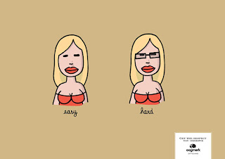
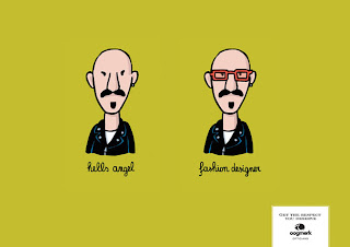
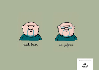
So, all these ads were pro to glasses. Each picture was comparing a person with and without glasses. It seemed to me that the one with glasses was much better because they words that were used to describe the person with glasses had a more positive connotation. Like fashion designer and Dr. Professor had a better connotation than devil's angel and truck driver. In society, a person can be judged differently if they have glasses. In this ad, it's probably better to have glasses because you look more intelligent.

Let me start from the first picture. So, it's a girl who's called easy without glasses and hard with them. I wasn't too sure what the girl was, but it seemed to be one of those "strange" occupations. If you know what I mean...Because by the way she is dressed, in a tube top, and the emphasis on her boobs with the defined lines, it seems like she isn't a super academic person, but that's a bad generalization. Oh well, this is just my opinion. With the description of "easy", it might just mean that she's one of the typical people who just work in the business, but with glasses she might be a "nerd" kind of girl, who doesn't know much, making her "hard". I didn't really like that first picture, but it was interesting...

Onto the next picture, it shows this punky guy on the left and he's described as hell's angel. He seems to be one of those motorcycle, tough guy kind of people. On the right however, with a pair of orange glasses, he's a "fashion designer". His style immediately changes with the glasses because they detract away from his devilish eyebrows. The bright color of his glasses are just like fashion designers nowadays, with their quirky color combinations, and the one ear piercing adds to that odd designer style.

In the last picture, it shows a gruffy looking guy described as a truck driver, without glasses, and a professor, with glasses. I found this picture particularly funny because a truck driver can be transformed into a professor with just an accessory. The style of the glasses are key in what a person becomes with them on. If you choose a style that doesn't suit you, how people judge you can become more negative rather than positive.
In the small box on the right, the brand of glasses and their motto are stated. I definitely say that the wording in that box are way too small for anyone to read, unless they zoom into the picture or post the ad a it bigger. Their motto is "Get the Respect You Deserve". I guess that means to get glasses or else you will be underestimated. I just thought that the motto was portrayed well with the ads. But, I feel that their saying can be interpreted in an offensive way. It could mean that you, without glasses, look sketchy, but with them, your look is greatly improved and seem like a success.

Overall, these ads were funny to me because each picture's comparison were true. As a prospective customer, I would probably get glasses, since it would make me look "better". However, it all depends on how you interpret the ad. Like you could be going for the tough look so you might not want glasses. Or you could be like me, who didn't want to look like a nerd, and get contacts. I liked the words that were used to describe the people. The colors were kind of funky, but I didn't care much for them because I was more attracted to the people. These ads were fairly effective and should do pretty well in converting people to wear glasses.


Thursday, November 29, 2012

Dissecting My First Print Ad- COFFEE...(yay!)

Practically everyone nowadays depends on the Internet for social networking, researching for homework, looking up something, and much more. It seems like the most common place for free WiFi is at a coffee shop. Around my neighborhood, every Starbucks I see is filled with college students researching or studying for a class on their laptops. Other people seem to use coffee shops as their office! We're constantly using the Web for many different purposes and hotspots are a great place to stay on task.

As I was surfing the web, as I usually do in the evenings, I came upon this print ad while searching pictures of coffee. (Don't ask why I was looking up coffee images...) When I first saw it, I didn't quite understand what the message was. I thought it was just one of those "latte art" kind of pictures, until it hit me like BAM. I realized that the image inside the coffee cup was of the WiFi logo! From there, I definitely knew where this print ad was going. The message was pretty much about free WiFi at a coffee shop; and my thought was correct. Below the cup of coffee, it said, "Free WiFi now available."

The whole print ad was quite simple. Just a classic cup of coffee with the WiFi logo. The only words that are on the ad are "Free WiFi now available" and "Brucciana: Family Craft Bakers and Cafe". The color in the pictures is just like it is in reality, but it also has a comforting vibe to it. The color of the wood table is a nice, deep earthy brown and it matches the brown of the coffee. Although I'm more tempted to just buy the coffee, than use the WiFi, I guess that was the purpose of the ad. The print ad also does a good job with making the words stand out from the dark brown, and it catches our attention. But, the size of the font was a bit too small. Nonetheless, if I was a student in the UK, this ad would for sure intrigue me. I would immediately take advantage of the free WiFi and practically use the cafe as a second home to do homework.

In my opinion, this ad was fairly effective in getting the point across to the consumer. However, it might not be immediately obvious, but once you see the WiFi logo, the message should be clear. I really liked the rich shades of brown in this ad because it gave a cozy feel. I searched on Google this cafe and discovered it's located in the UK. Bummer...it seemed like a cool place. Maybe it's just because I'm obsessed with coffee, but I would totally fall for this cafe. This print ad is very creative and it should be successful in attracting customers.